Improving brand recognition by up to eighty per cent, colour plays a vital role in how we’re perceived. For instance, whether you have a homeware line or you’re a kitchen designer, studying colour can help you attract the right clients. Covering everything from logo design to your digital presence, your brand colours should invigorate, inspire and engage. In this post, I’ll explain what colour psychology is, the meaning of particular shades and how they can affect day to day choices.
Colour psychology
Colour psychology is the study of hues and how they affect human behaviour. Although not obvious to some, their influence is real and could explain why we sleep better in rooms with blue walls. Colour incites emotions in people, often beyond our control and therefore, is a powerful communication tool. Much like the colours you’d choose for your home, it’s the same with your brand – let’s explore some shades in more detail:
Pink
A traditionally feminine shade, the colour pink represents contentment and approachability. Once reserved for little girls toys, it’s no surprise more brands are adopting this hue like vintage furniture pro, Vinterior.
Black
A popular retail shade, the colour black embodies sophistication and elegance. When used for text, it’s also easy to read, especially when contrasted with lots of white space. Prominent names who use black in their brand include MADE.com, Oliver Bonas and Patch Plants. Additionally, black text is used for their call to actions, which draws the eye and woos prospects into ‘adding an item to their basket’.
Grey
Representing neutrality and balance, grey is a shade that appeals to a broader audience. It also works for the technology sector as well as luxury brands like Harvey Maria and Cox & Cox.
White
In colour psychology, white is the hue that implies humility and innocence. It’s perfect as a background colour for product photos or for text when the background is dark. One of my favourite examples is the brand Rockett St George, whose logo is the epitome of chic, sleek style. Make sure to use dark and light colours correctly so that users can enjoy your content without getting eye strain.
Blue
According to psychology studies, blue is the colour that signifies trust and strength. Kast Concrete Basins use blue, which helps to position their brand as the go-to manufacturer of contemporary sinks.
Yellow
The colour meaning for yellow revolves around sun, optimism and happy vibes. Yellow is widely considered a cheerful hue and just a touch of this shade can associate your business with something positive. Take the IKEA logo, which uses yellow to hint at something big and exciting. Most first-time buyers will likely furnish their homes with the brand making yellow a great colour to associate with this milestone.
Green
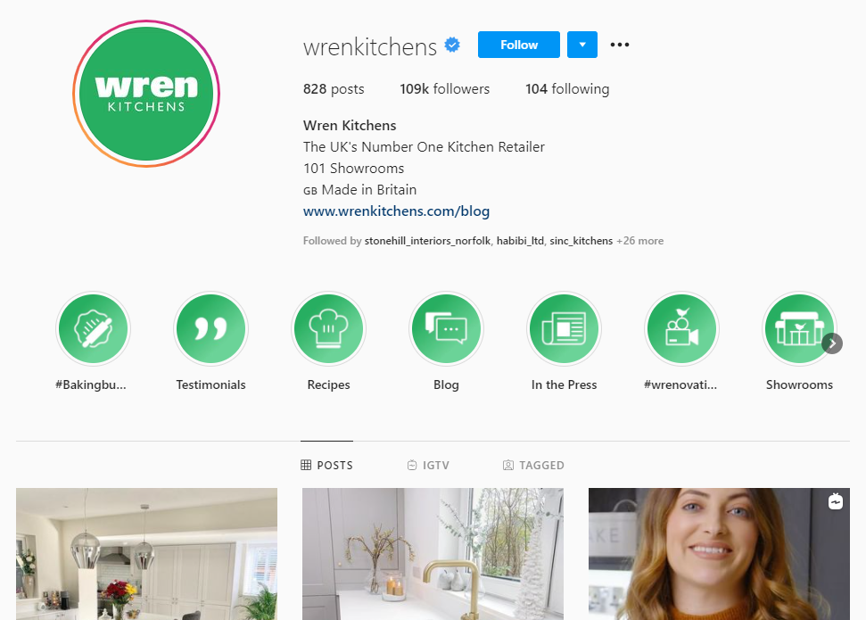
Calming and restful, the colour green is the easiest shade on our eyes. This is because upon hitting the retina, no adjustment is needed, in fact, this colour is actually said to improve vision. Brands tend to use green for a down-to-earth feel, calm their audience, or symbolise growth. Pick the right shade, and you’ll boost your reputation and business, just look at Wren Kitchens and their iconic ‘Wren Green’.
Thank you for reading my post, I hope you’ve enjoyed – what’s not to love about colour? When we consider the influence it has on how people think, it’s definitely worth understanding! Thanks again.
A Guide to Branding and Colour Psychology
